Is Divi 3 real competition for Beaver Builder – part two
Following up on part one, first thanks for all comments on the Beaver Builder facebook group. We continue rebuilding Bridge to Divi version 3 and we will add some other more technical aspects of Divi and will conclude with our final judgement for as far as possible.
• Please read part one first before reading the final conclusions
• We did try our best to rebuild Bridge as good as possible, but due to limited time, we limit our test to the basic principles of how things work in general
• Don’t want to read? Look at the final result
• Please keep in mind that this judgement is just based on one project. Others may share other thoughts, results and experiences.
Please share your thoughts on the BB facebook group
Some confusion
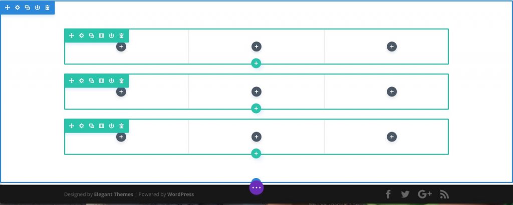
We also want to share our confusion in doing things before finding the right solution. The ‘WE ARE BRIDGE CREATIVE AGENCY’ block was created as a full-width segment. We still don’t understand the concept of segments, just because of the content ‘under’ this. We somehow seemed to have created a non-full-width segment (blue box), in which we could define a row as full-width (green box). We are still looking why this is possible and even why the principle of segments exist.


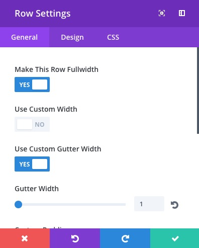 Within the ‘green’ row settings we defined 4 columns to get 4 images in. At that moment we did not care too much about the way this was done in either Beaver Builder or Bridge itself, with or without text. At first we had some white space between the 4 uploaded images, which we ‘reset’ by setting the ‘Gutter Width’ to 1, without knowing the meaning of the value ‘1’. With that value we managed to get the 4 images full-width on one row in full-width.
Lightbox
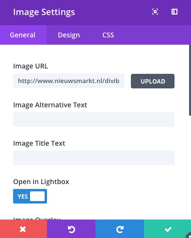 As an extra option we enabled the ‘Open in Lightbox’ option in the image settings panel. The animation effect can be set for each individual image, but options are limited to just the movement direction. Divis option around reponsive design are everywhere. In all popup-settings-windows choices can be made whether or not to display ‘things’ on various devices. We could not let Divi open another image in the lightbox by clicking on one of the four in the row, just like in Bridge. But we also did not get that done in Beaver Builder that exact way.
Block of nine
Beaver Builder implementation
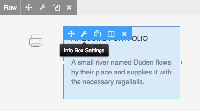
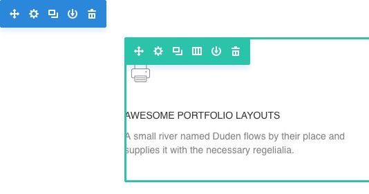
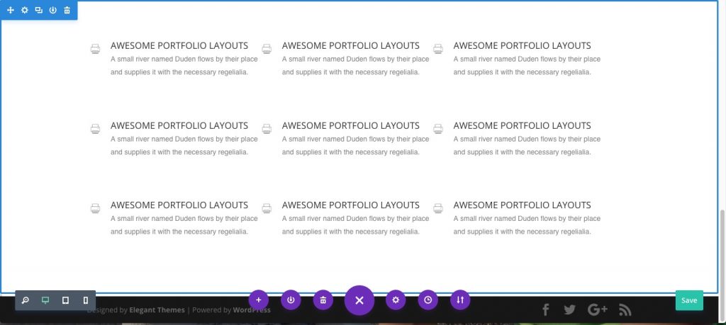
The next block we had to create was a block of nine little text areas with a small icon left of it. In Beaver Builder we used Fontawesome. We could not find a Fontawesome implementation in Divi 3. For the previous version of Divi, there was a workaround, but we don’t know if that will also be valid for version 3. In Beaver Builder we used the UABB Info Box for the text and the UABB Image/Icon module for the icon.
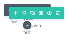
 In Divi we started with 3 rows with each 3 columns, we could not make a column with 6 rows like in Beaver Builder. So we expected to be able to position the icon left of the standard text module. At first we could not get the two modules in one colums.
 In Divi 3 (just like in the previous version) the maximum number of columns seems to be 4, a workaround describes how to get 5, 6 or more colums. We did that in order to get the required layout, but after adding some little custom CSS, we could not ‘touch’ the module settings anymore, we had to insert more text to get the grey settings bar a bit lower to access it. Although not perfect, we managed to get a similar effect like in Bridge.
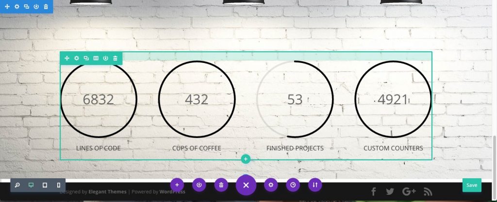
4 counters
Next challenge was to get 4 counters in one row wit a parallax background image. We started with a full widt segment, because we thought we needed that for the full-width background image. The seemed confusing (again), because only a limited amount of module types could be inserted in a full-width segment. And counters were not part of that. So we created a non-full-width section and inserted the background image, which ‘reacted’ full-width. A bit confusing, but after that we could create 4 columns to get the counters in. Somehow the concept of sections confuses us everytime. Although the background image reacted full-width, we could not set any aligment and/or parallax behaviour, only some padding was possible, which gave some ‘illusion’ of positioning.
What module to choose?
We made the choice to use the ‘Person’ module for the section under the counters, because that was the easiest module to get one image positioned left of the text. The basis text module did not work that smoothly to get this done the right way. In the whole process we changed modules so now and then to test if another one would come closer to the Bridge original.
Slower
Divi gets slower if the page ‘grows’ in the amount of sections/rows/modules. Duplicating sections took 1-2 seconds before the appeared and also repositioning them took 2-4 seconds before it appeared at the required location. Also deleting needs some processing time. We don’t know why.
Compromise in module possibilities
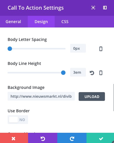 Just like in Beaver Builder, also in Divi you have to find your way in using various modules to get things done the way you want. With our first Beaver Builder test (without add-ons) we could not get a 100% perfect ‘Bridge look alike’. We wanted to come as close as possible, and we tried the same with Divi. For example the ‘call-to-action’ module. At first we uploaded the background image in the texteditor field, but after playing with the module, we discovered that the background image upload was under the Design tab, we would have expected that important part of the module in the General tab. Just a matter of getting used.
Last blocks
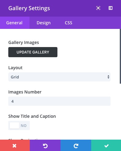 The rest of the rows/modules were in some way just copies of other previously used rows/modules, except for the gallery block, which was one of the smoothest modules to use to our own surprise.
Other things we noticed
First of all, ‘redo’ and ‘undo’ is a very nice feature within Divi 3. We did not test how far a users could ‘go backward and forward, but it looked like it was ‘kind of’ unlimited.
The generated HTML source was ‘just’ 53.607 bytes and looked relatively clean to us, which was not that bad, considering the length of the page and the use of many sections/rows/modules.
The standard WordPress editor shows the page in Visual mode as a collection of Divi segments/rows/modules and they can be edited in the WordPress backend as well. If that has any advantages remains to be seen.
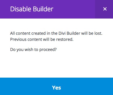 Actually we just went ‘there’ just to see the ‘Text’ mode, in order to give some judgement of the use of shortcodes within the WordPress environment before generating the final output HTML. The only way to see that code is to ‘Use Default Editor’. Trying to do that gave us the warning that all Divi content would break and that previous content would be restored. In this case, we did not try that option, because it would delete the testpage we just created. We will make a duplicate of that page and test the shortcodes aspects later, if they remain in any way.
Speed
Using Pindom from Stockholm – Europa resulted in a loadtime of 1,69 sec, compared to 2,33 for Beaver Builder. We think the little slower performance has to do with the fact that the BB setup also included the add-ons from PP, UABB, BeaverLodge and BeaverTunnels.
Final judgement
- Divi 3 is in no way a Beaver Builder killer. Divi 3 is kind of ready, but the modules we used still need lots of attention to make things more clear and easier to configure.
- We needed a lot of time more to rebuild Bridge compared to the way we did that with Beaver Builder in the time we had more experience. In that time we rebuilded Bridge in about 2 hours and with Divi it took about 4,5 hours to find our way around in Divi. Not a very hard comparison, because we knew our way better throughout BB, but still, even with that knowledge we would have expected to be at least a bit faster than 4,5 hours.
- The user interface looks clean at first sight but in the end the ‘jumpyness’ disturbs us and we think it will do so for many users. Especially when buttons are partly hidden behind others and not easy to grab.
- The segment concept and the limited modules available in a full-width-segment is totally ununderstandable.
- A little advice in the direction of Beaver Builder: keep the user interface as simple and quiet as possible in version 2.0
Please keep in mind that this judgement is just based on one project. Others may share other thoughts, results and experiences. Please share your thoughts on the BB facebook group.
8 Comments
Leave a Reply Cancel Reply


Thanks for reviewing Peter! Great job…usually I love to test many builders.. I let some urls here, for the people that love to explore:
http://oxygenapp.com/
From the same guys of WP All Import. They just started releasing this composer.
https://pagebuildersandwich.com/
I love the UI, very nice shortcuts on their tool.
And the last one:
https://kingcomposer.com/
I hope you find some interesting one… people is very passionate about their fav page builder.
Excellence job again Peter. Thank you for taking the time. I don’t know why I find this all so interesting really.
Elegant themes have done an excellent with Divi. It’s not for me. They make that clear (as do others) every time they announce “this release was build from the ground up”.
Until a page builder can do all that a client requests I’m stuck working at the ground level.
Fortunately there is the lovely stable Beaver Builders for folks like us. Divi’s great value. As long as no-one goes expecting free php help from support it’s fine.
Thanks David for your comments. Well, in my opinion Divi is not great yet. They released it just two months too early in my opinion, too many small little things are not yet perfect, but could be in time.
Their user-interface is another thing. Nice at first sight, but too jumpy in day-to-day work (at least for me). I don’t hope BB will go into that ‘christmas tree’ direction. Although BB interface is also not perfect, at least it is quiet and does not distract from the work to be done.
It was a nice job to test it all, we all know what we should know now to help the BB community in what to do and what not to do…..
Thanks again!
Peter
Hey @Roberto, thanks for mentioning Page Builder Sandwich! Personally, I love the Ctrl+Z shortcut 😀
@David: What do you mean by “until a page builder can do all that a client requests” exactly? What do client’s usually require? (We usually deal with WP beginners as audience in PBS, specifically those without any coding knowledge, so your input would be a great help!) 😀
“A little advice in the direction of Beaver Builder: keep the user interface as simple and quiet as possible in version 2.0”
The previews are looking great for Beaver Builder. I don’t like animations so hopefully it isn’t as animated as Divi’s interface.
I can’t wait for the Beaver Builder undo feature like yourself.
It’s all so exciting!
I have lifetime / the top subscription with both BB & Divi.
I very much use BB over Divi at the moment.
Divi 3 looks very interesting. Certainly they have done a great job and the approach is very innovative.
I guess the thing to remember is that Divi 3 is like a brand new product in many ways. It’s fantastic to get this comparison now, but maybe a little hard for a new product to be ready to fight the market leader (at least the professional’s favourite). And even better in 12 months to see where both products are (that is exciting – the speed at which things are changing).
There are a few sites I have done where Divi was a better choice for the client. However, I have to say…this was choosing a back end builder over a front end (based on what I thought the client might try to do – e.g. destroy our design!).
Great review – thanks Peter
Hi Peter,
I read your reviews and liked the part 2. It is more in-depth and shared the good and bad points about Divi.
I love the new interface of front end editing. But, this is something that I find a bit annoying as well. It takes a while to get used to the color and icon representation for each section. I think, that’s fine because every tool has its own learning curve.
I do not see it as a BB killer either. Both these tools serve different audiences. There are people who love speed, performance, and clean code more than anything else. That’s where BB excels. I haven’t had a chance to check how Divi saves / compiles the JS and CSS.
It will be wonderful to see how BB 2.0 comes up with new UI. I have seen some of the concepts and like their approach. Though, I don’t like the UI videos that Justin shared. I shared my feedback with him and I think, it was too early. They are still working on fine tuning it. These are just early concepts.
I would love to see a cleaner UI for BB 2.0. Not something loaded with improper contrast and dull colors or shadows. It’s so distracting.
Once again, thank you for putting up such a great review. I would also love to see it from a point of view where you do not compare it with BB or do not even think of BB while using Divi. Yes, it will take a while to get used to it. But, I think, that might change how you feel about Divi.
At the end, all I can say is, no page builder is perfect. There are limitations with all of them. So, knowing the basics of web development is always helpful. A bit of CSS can do wonders in fine-tuning a website.
Thanks.
I used beaver before and found it hard to use so I left it, I tried divi I found it much easy and the interface is really awesome and super fast.