Making the Bridge theme in BeaverBuilder
The Bridge theme is one of the examples ‘everyone’ was dreaming about in the days that pagebuilders started to gain popularity. In this article we describe the process of ‘copying’ Bridge into the Beaver Builder pagebuilder.
• Don’t want to read? Skip to the resultpage now
Updates
2016 September 10
- At first we did not know that Beaver Builder offered a very nice mega menu possibility, by using the css class ‘mega-menu’. Read the instructions on how to use it.
2016 July 20
- We decided not to use some kind of ‘mega menu’ plugin to fully ‘simulate’ the menus used in the Bridge theme. We tried the Max Mega Menu plugin, but we were overwhelmed by all possible options. For our test purposes, we did not take the time to learn this one, because it would simply consume too much time. So, we stick to the standard menu options offered within the BB theme.
- We do however want to change to menucolor depending on the slide we are in. We managed to change to menucolor based on pageID, with:
.page-id-134 .fl-page-nav-right .fl-page-nav-wrap .navbar-nav > li > a {
color:#000000;
}
.fl-page-nav-right .fl-page-nav-wrap .navbar-nav > li > a {
color:#ffffff;
}
In the example above we color the menu black for page 134, all other pages just get white menu items. So for now we are going to look to find the ‘id’ of a slider in het BB block, which is the top slider block.
Challenges
The first challenge is to get the menu above the main slider on top of the homepage (see demo of Bridge). Although Beaver Builder had some very nice menu settings, this requirement does still need some CSS to get it work right.
Heavy LayerSlider
Bridge uses Visual Composer as base pagebuilder. It does however use the LayerSlider plugin, which is a very heavy but advanced and responsive plugin for high-end slider applications. The text integration reacts very well in responsive situations, but depending heavily on JavaScript and CSS. The ‘Content Slider’ within Beaver Builder is in that way limited in its possibilities. Probably we can not get the exact effects as in Bridge. But we are still trying to do so. Stay tuned to this article, any updates on our ‘road to perfection’ will be published here.
We did get the suggestion to use FlexSlider (from WooThemes) or RevSlider (from ThemePunch)
The row
We start with just a 1-column row below the header. Because we are going to use a slider, we want all content to be fullwidth and fullheight (as a base setting, adjustments later in the slider settings). The content alignment setting can be left to center.
Avoid using a background slider here. It is possible to use a slider as background of a row. Using this slider will result in non-responsive images! Therefore we have to add the ‘content slider’ module to get reposnsive behaviour.
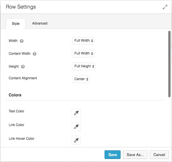
Full-width and full-height settings for the base of the row.
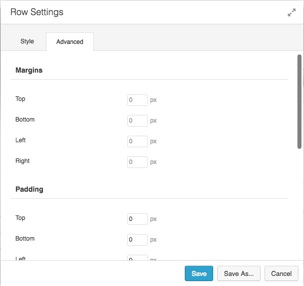
We also set all all padding and margin values to 0.
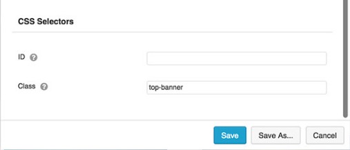 Also under ‘Advanced’ add the CSS class ‘top-banner’. This class will be used later to ‘shift’ the slider up. It is important to do this at the moment of creation of the row, after the CSS style is active the row is shifted to a position where you cannot access the ‘row settings’ button anymore, because its position has shifted under the Beaver Builder admin bar!
Update: Although the row setting button cannot be accesssed at the top of the row, because it is at position 0, we learned that the row buttons also appear at the button of the row. So, if you forgot to set the CSS class, you can indeed do this later.
Content slider
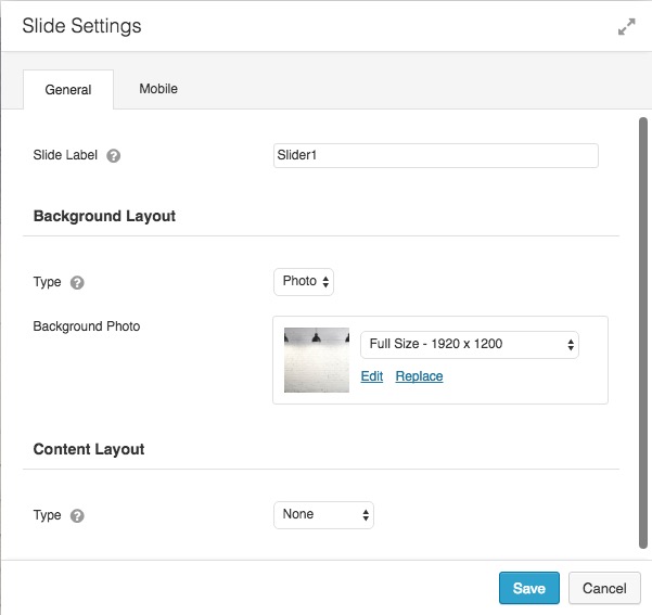
After creating the row, we insert the ‘content slider’ from Beaver Builder Pro. In later tests we might try some of the other slider possibilities, developed by the various BB add-on developers. The images we used in the example are 1920 x 1200 pixels. We set the height for the content slider to 800 pixels. That is about the height from our ‘Bridge’ example, shown on a 1440 x 900 screen. You can however experiment with other values depending on your screen resolution(s) and (customer) demands. Unfortunaltly there is no ‘one-size-fits-all’ rule for this.
The inserted video does not work wel yet, although we use the right iframe to autoplay the movie
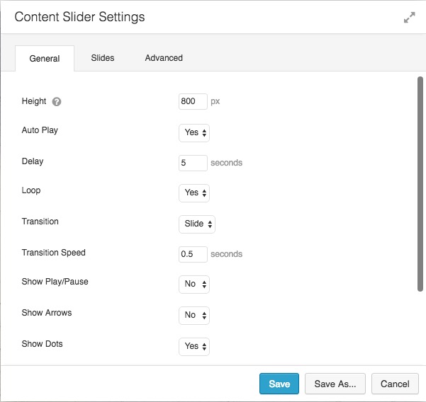
Only set the height to the value you wish, other setting me be adjusted later.
Insert any number of images in the content slider you want, but keep the dimensions for every slide the same.
Customizer and CSS
The customizer is our main theme settings area within the Beaver Builder theme (part of the Pro package).
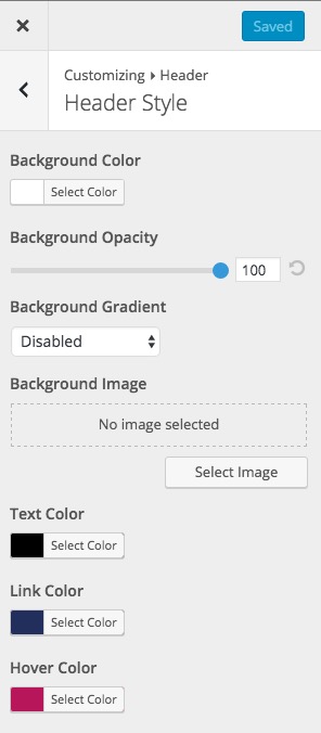
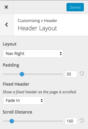 We will change the appearance setting of the menu by selecting Header > Header Layout. We keep our menu on the right site (just like in Bridge), with a padding of 30 pixels. The Fixed Header option will have to be set to Fade In, on a Scroll Distance of 160 pixels.
If you want, you can just copy the original logo form the Bridge demo to see how it works in the Beaver Builder rebuild of Bridge. Resize it to 145 x 77 pixels, since the original in the demo is much larger than needed in the header area.
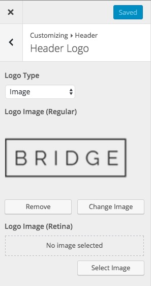 Set Logo Type to image. Additionally you might upload a Retina ‘compatible’ version of the logo.
We do need some (little) CSS to get the things done for the transparant header area. We used some of the code supplied by the article from BeaverChildThemes, and also lookes at a simular article on Beaver Brains. Also find in the first one a more in-depth explanation of all CSS details, although we changed some values to make it fit better within our ‘Bridge’ rebuild.
li[class*="current"] > a {
 color: #b7165b !important;
}

body .fl-page-header-primary {
 background:transparent;
 position:relative;
 z-index: 20;
}

@media screen and (min-width: 993px) {
 .top-banner .fl-row-content-wrap{
 margin-top: -140px;
 }
}
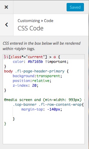 The first part is an extra CSS setting we made, outside the purpose of this tutorial. It colors the main menu button text color if one of it’s submenu items has been chosen by the visitor. It improves the user experience of using the menu.
The second part just makes the header background transparent and ‘puts’ the header (with menu) above the slider bij setting the z-index value. Initially this value was 10, but FireFox did not show the menu, so we changed it to 20.
It is important to keep a header color defined in Customize > Header > Header Style > Background Color, because this color appears as background in the fixed menu when scrolling the page!
 The margin-top negative value of 140 is to shift the slider above. Also that value might differ in specific situations, but in out setup this worked just fine.
Modules
It was also a challange to choose the various modules form the various add-on developers, ofcourse starting with the modules from BeaverBuilder itself.
From top to bottom, we used the following modules to rebuild the original ‘Bridge’ theme.
- Content Slider (Beaver Builder)
- Info Box (Ultimate)
- Photo (Ultimate)
- Info Box (Ultimate)
- Interactive Banner 2 (Ultimate)
- Info Box (Ultimate)
- Info Box (Ultimate)
- Counter (Ultimate)
- Photo (Ultimate) and Call Out (Beaver Builder)
- Info Box (Ultimate)
- Hover Card (PowerPack)
- Call Out (Beaver Builder) and Photo (Ultimate)
- Testimonials (PowerPack)
- Logo Grid & Caroussel (PowerPack)
- Text Editor (Beaver Builder)
Although it looks like a preference for Ultimate, in this project we might change modules to get closer to our ‘Bridge’ destination.
Results
Please look at the results below and vist our testpage to see how far we came unitil now. And stay tuned for our updates.
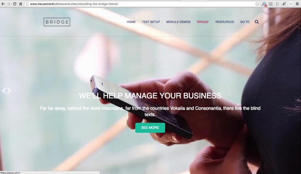
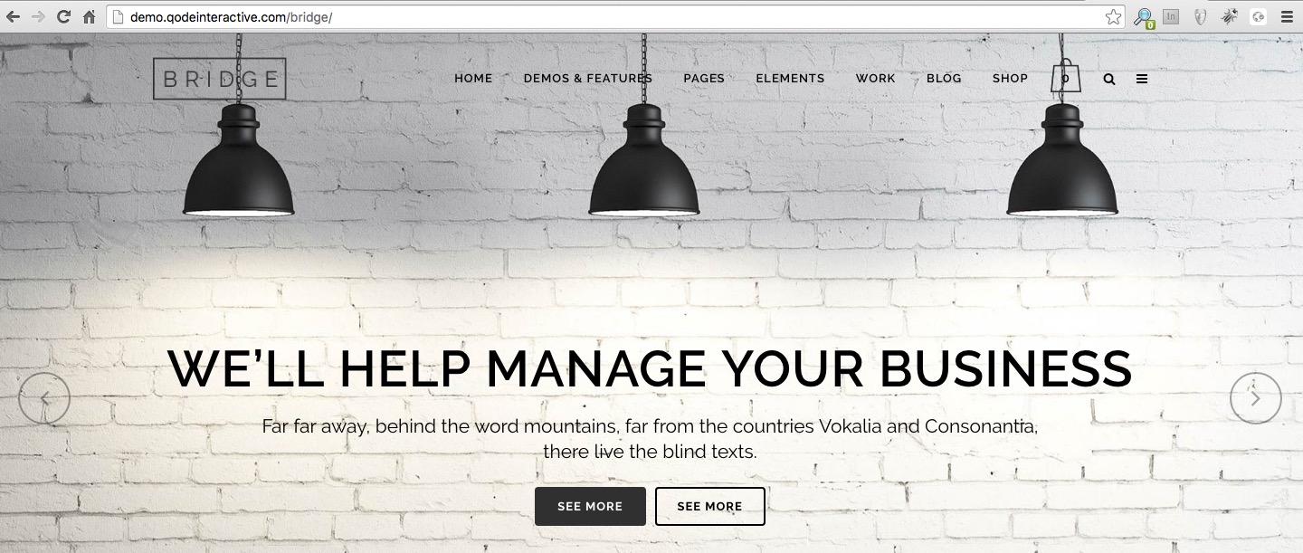
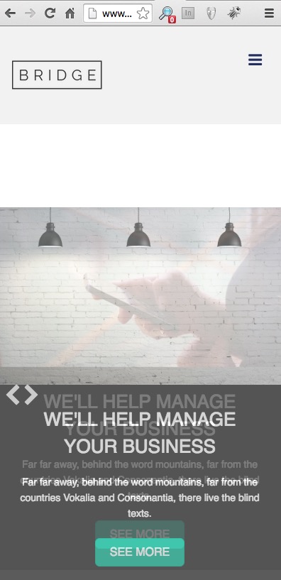
The base of the page, with one of the slides
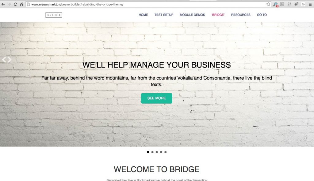
After sliding, look at the menu in the top
On mobile still not ok, text under slider and a gap between menu and slide. Image just in between two slides 😉
Challanges
There are still some things to solve to get close(r) to the ‘Bridge’ example:
- CSS settings for responsive presentation
- Slider in responsive mode, especially for text display
- menu colors depending on content below
- video in the slider not running smoothly after every reload of the page
Suggestions
Do you have any ideas to improve this project? Module changes, CSS settings or any other suggestions are very welcome. Mail to peter@luit.nl or leave a suggestion at one of the Facebook groups you’re in, be sure I am there ;-).
6 Comments
Leave a Comment


Hi Peter. This really is excellent information. I see you’ve already helped someone decide on a purchase and probably others who did not say.
I know how long it takes to put together a post half this detailed so thank you very much.
Thanks David. Yes, I also saw some nice reactions in the various BB related Facebook groups. I am still not 100% satisfied with the result, but have to find the time to get the last details done.
Greta Work!
How about the slide out feature Bridge uses with the hamburger icon on the destop and mobile versions. Slides out and shows a widget menu.
Jason, nice idea, we could give that a try. I know GeneratePress had a standard feature for that.
That the feature I’m waiting to see in BB! An off-canvas feature with options like ‘slide out,’ ‘full screen,’ as both a secondary menu and widget options. etc. Been playing oaround with adding it manually but to no avail.
Hi Peet, ik zit nog steeds te zoeken naar een oplossing voor het te kleine logo bij het scrollen in een pagina. Kom ik jou ineens tegen! Helaas nog geen oplossing voor gevonden.