Is Divi 3 real competition for Beaver Builder – part one
Last week I watched the video from Adam Preiser from wpcrafter.com. He compared about four pagebuilders. Among them Divi version 3 and Beaver Builder. I took the challenge to do some digging in Divi.
• In BB we used PP and UABB for some of the ‘modules’, so in a more creative sence the ‘BB/Divi Bridge’ comparison must be judged in that perspective
• Also read on what Chris Lema has to say about Divi 3
• Zie reacties op facebook
• Don’t want to read? Click to the results until now
Adam warned for fast judgements around the various pagebuilders. ‘It depends who you are asking this question’ is a very true statement. With that statement in mind and being more experienced withe Beaver Builder, I started exploring my way in the latest Divi version. To compare the two a little bit based on real work, I decided to make the same Bridge theme rebuild in Divi, like I had done before with Beaver Builder.
My first steps
As always you have to find your way in new tools. Making mistakes is common and you have to retry things more than once to understand the concept of things. The first thing I had to learn a bit, was the layout concept of Divi.
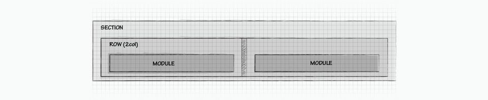
Sections are the basic top-level beginning in Divi. However I learned that there are two type of sections. In regular non-full-width sections, you add rows first, before you can add modules. In a full-width section you start adding full-width modules right away. Take good care of the fact that the list of available modules differ for regular sections and full-width sections. You can add any number of rows in a section and Divi offers various row layouts to be inserted. Modules determine the content of each column-row combination.
You cannot change a full width sections to a non-full-width section and vice versa. So you have to know what you choose before you start adding rows and/or modules.
 The user experience of Divi may look a bit ‘jumpy’ when you start, once you understand the use of the colors in the various Divi elements, you might get used to it. For example on the button of the screen I finally discovered the purple button with ‘…’ to get the ‘save’ button, shown below in the bottom-right corner of the screen.
At this moment of writing I don’t know yet the ‘big’ advantage of Divis choice to start with sections compared to just starting with rows in Beaver Builder

But no, it is not an extra step. In Beaver Builder you will always see the ‘done’ button in the top-right corner, but Beaver Builder asks you to conform the publication of the changes you made in the page.
Struggling a bit
It is not a real struggle to get through the first hours of using Divi 3. It is just a matter of getting used to it. And that is what Adam means by ‘It depends who you are asking’. If you are very experienced in another tool, that is your reference to make any judgement on another. So, yes I also needed some extra time to start working on what I really wanted to do: rebuilding the Bridge theme in Divi 3.
Getting things done
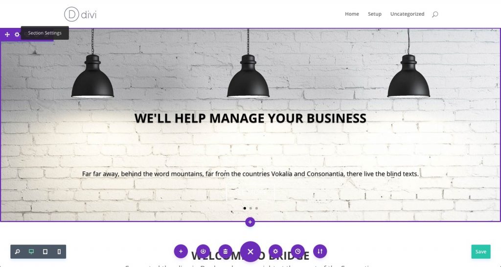
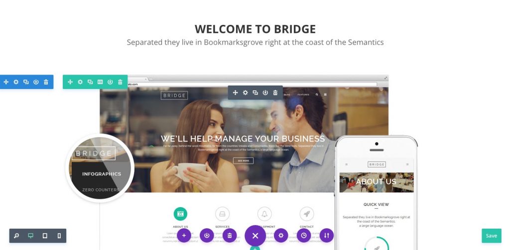
 I just wanted to try to do the simple things first. So I decided not to start with a transparent header/menu area, but started with the main slider. Since the slider is full-width, I first created a full-width section. Full-width sections get purple lines around its area, non-full-width sections get blue lines. Yes, the Divi team has looked at the BB user-interface as you can see in the screeshot above. In the upper-left corner, you have nearly about the same buttons to ‘do things’ with the section even in the same order: position, settings, duplicate and remove. The only ‘extra’ is to save the section as a template in the libray. BB has that options in the row settings pop up screen. The whole template concept is integrated in the user interface for sections, rows and modules. It is very easy to save them and load them for any section, row or module, locally or globally.
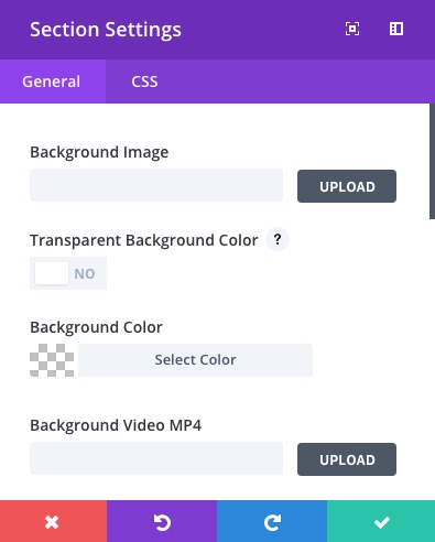 The sections-settings offers a straight forward set of adjustment. We did not set any background, since we wanted to insert a slider module with the images used in Bridge. In the section-settings it is also possible to insert a video, set the parallax option and some settings whether or not to use the section on various devices. The sections-settings did not have any option to adjust the height of a section, except for videos. I don’t know why they made a difference in not setting a height for an image, but making it possible for a background video….
Fullwidth slider settings
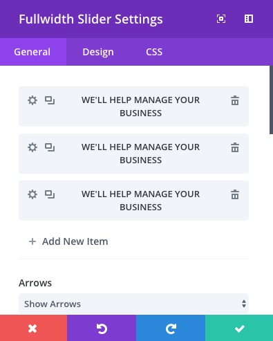 Divi combined a couple of things in this ‘box. They make a difference between background images for each slider and the slider image itself. In Divi it is possible to combine both a background image and ‘on-top’ a slider-image of the dimensions you upload it. So in our workflow to get Bridge we only used the background image. The rest of the settings are for the slider effects: time, arrows, dots below, loop, hover, parallax, disable on devices etc.
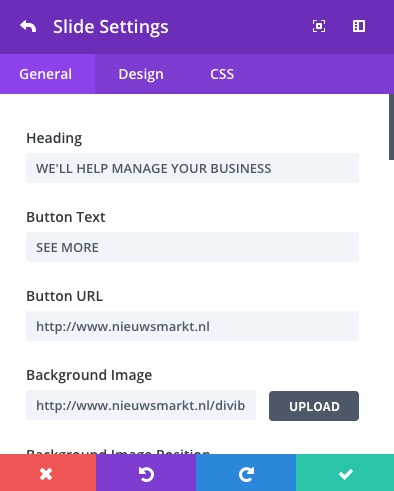 The individual slide settings contain a heading text, a body text and an action-button per slide. All of the options are straightforward to use, like colors of various elements and aligments etc.
Height?
In Beaver Builder you can set the row-height to ‘default’ of ‘full height’. The last option was our choice in rebuilding Bridge in Beaver Builder. Within Divi we could not find any height setting in either the section or the module. Setting the top padding to 120px effected the position of all ‘overlay’ content above the background image. But we could not get the image as high as we wanted. Still looking for that……
Next: full width header section
 A little ‘thing’ on user experience in Divi is the module-name you have in use at a certain location. The button only shows ‘module settings’ and not the name of the module. You have to click on it to know in what module you are. Not that important, but could be something to change in 3.0.1.
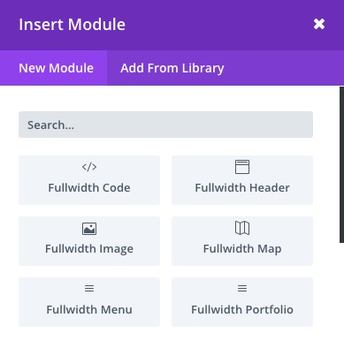
 As we mentioned, we do not use any add-ons (we don’t even know yet if there are devleopers working on this), so we are ‘limited’ to the core of Divi. Again take care of the fact that the available modules are different for a full-width (left) and non-full-witdh (right) choice of your section. Since we did make the choice the make the section below the slider also full-width (could be non-full-width as well), we choose the ‘full width header section’ as the module for the text below the slider.
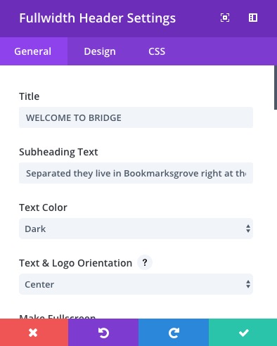 This module did what we expected to position a title and a subheading text, just like has been done in the original Bridge theme. the module offers much more than just this. Also a call-to-action button and a logo might be added among all possible CSS setting. So enough creative possibilities here.
Image
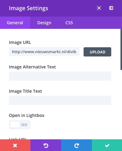 For the next module we created a non-full-width section with just one row and one modules, called the ‘image module’. Also here all possible settings, also the animation on how the image should appear are available in one settings pop-up screen. The ‘open in lightbox’ option generates a pop-up of the image.
Again, once you start and learn how to use the various elements of Divi, as a BB user you will learn fast and won’t experience many obstacals to use it.
Part two
In part two we will add the rest of all Bridge elements in Divi. Conclusions so far? Well, we are not ready yet, but we can imagine some of you want to read what we think so far. Some of our findings:
- if you are used to beaver builder, take the time to get used to Divi. It might not look logical at first sight, but with some trial & error you get used to the basic understanding of the Divi concept after a maybe two or three hours
- although logical in the end, the whole user-experience still remains a bit ‘jumpy’. Every mouse movement show ‘+’ buttons to add sections, rows or modules. Advantage is that you don’t need to drag anything and your screens remains ‘clean from any menus’. But the constant on/off appearance of ‘+’ buttons bothers me more than the BB user interface. We already know that BB in 2.0 will change its user interface. We have already seen some use of colors in the pop-up settings screens, but don’t know how things will develop further.
- for the rest of our preliminary judgement, until now we cannot find any special disadvantages or advantages in Divi 3.
In part 2 we will also look at the generated source code, the use of shortcode and the possible overal effects on speed and SEO, if we would be able to judge that aspect. After all of that we will publish our final judgement.