Responsive top hero-image with call-out in Beaver Builder
Following the previous post on building a hero top image per page and coloring the menu-items seperatly in Dynamik, we will now focus on the same challenge in Beaver Builder.
We already played a the result until now can already be viewed. How did we do this? We use the base of a couple of things we did to rebuild the Bridge theme in Beaver Builder.
Row
Like always we start with just a simple row, with the settings we used in our Bridge experiment, so the CSS class top-banner will be needed here as well. Again, set all margins and padding to value 0.
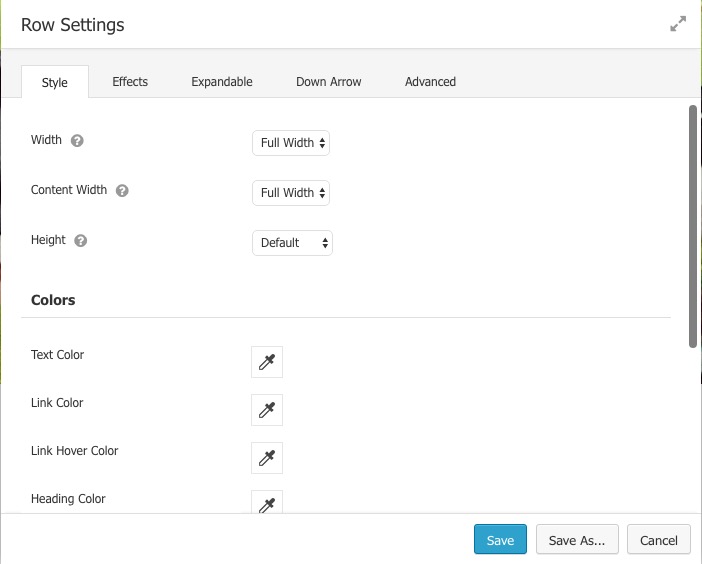
Base row settings
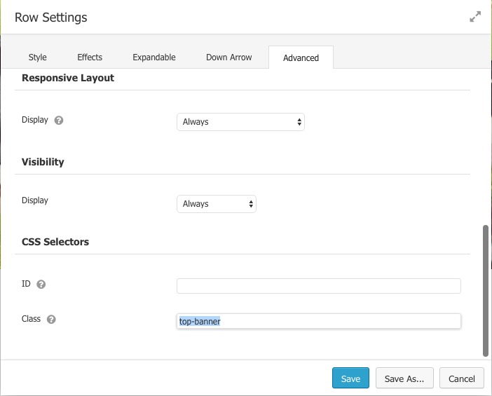
CSS class
Remember on how to access the row settings later (in case you need to). Once the hero image is at position 0, you can only access the row settings on the bottom left corner of the row.
Bottom left corner for row settings
Smart Banner
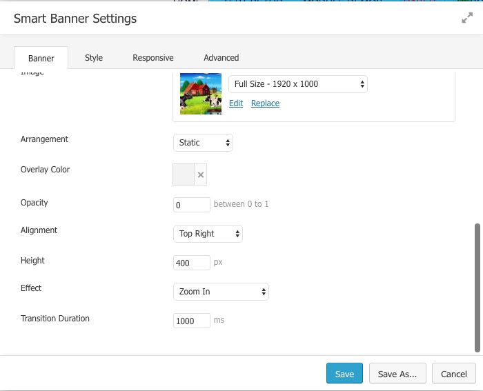
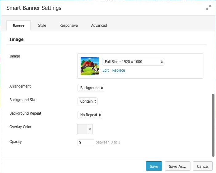
We use the ‘smart banner’ PowerPack module. That module in very flexible in many aspects, as shown in the screenshots below.
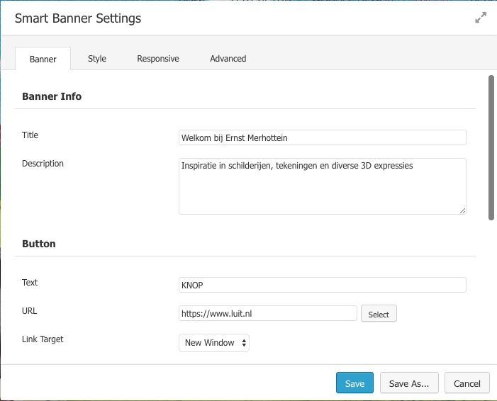
The first settings are just for the text and the call to action button. More important are the coices around the image settings. Although this modules allows some nice moving ‘effects’ by choosing ‘Arrangment > Static’, we discovered that this setting does not work nicely with our repsonsive requirements.
So we now choose for ‘Arrangent > Background’ and ‘Background Size > Contain’. That gives our required result on every resolution/device. However, we will still serach for a solutions where we can be more creative with ‘inserting’ the hero-image into the row.
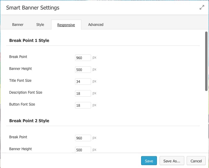
The module does have some @media points for responsive behaviour. Play for yourself with the settings to get the results you want.
Customizer
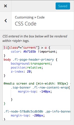 Our final settings will have to be done in the themes customizer. We don’t like negative values for margins/padding, but could not find another way (yet) to position the call-out text relative to the center of the image.
The first three ‘blocks’ are explained in the Bridge project. Only the last CSS is for setting the call-out text in this module.
.fl-node-xxxxx seems to be the current/actual CSS class, in which we only added a margin-top of minus 200 pixels.
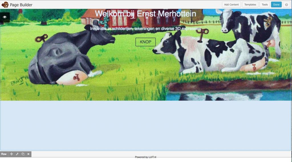
Final result
The results until now can be tested bij going to our cases page in the Beaver Builder part. Try the various resolutions in the browser or visite the page via any mobile device. We are not ready yet and try to find other solutions as well. But if you want an hero image per page, this is a noce way to go.
What is next?
We did not forget the colors of menu items per page. We are still working on that one, so come back for updates later.
