Using Dynamik conditionals for menucolor and hero images in header
In the pre-BeaverBuilder period we used to work a lot with the combination Genesis/Dynamik. Dynamik still is a wonderful tool to develop sites with some special demands. An example.
• We will explain the base and the most important parts to be able to start doing this yourself
• In the coming week we will try to do the same with Beaver Tunnels in the Beaver Builder theme
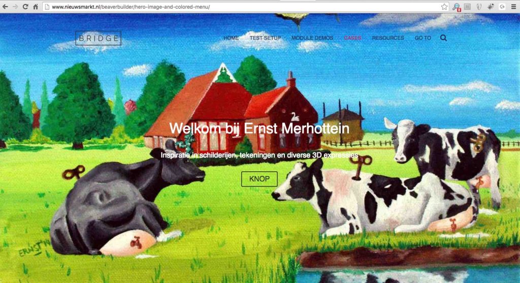
• View our ‘rebuild’ in Beaver Builder
• Want to see the website first? Go to Ernst Merhottein
Making a site for an art painter is a challange on its own. To clearly understand the creative need, will take some time before even beginning with the design.
No slider
One demand was clear form the beginning: no slider. ‘I just want a small impression of a couple of my paintings and drawings on every page. And please show as much colors as possible, avoid a business look’. What those requirements we started within Genesis/Dynamik. With a couple of challenges.
At least we started with more than enought images from the painted collection from Ernst Merhottein
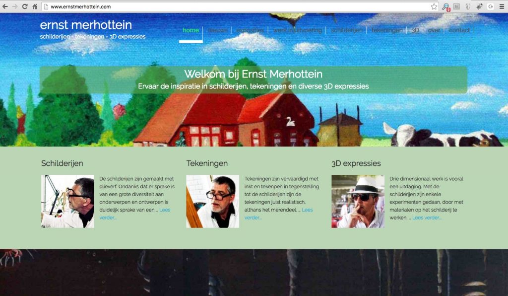
Top view of the site
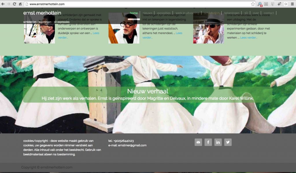
Bottom view of the site
Dynamik
We used the EZ homepage setting 1-3-1 in Dynamik Settings. That gives one row with one column at the top of the page (normally under the header), one row with 3 columns in the middle of the page and one row with one column at the bottom of the page.
The content of the various blocks on the homepage work through the use of widgets. We decided also a 3 column setup for the footer.
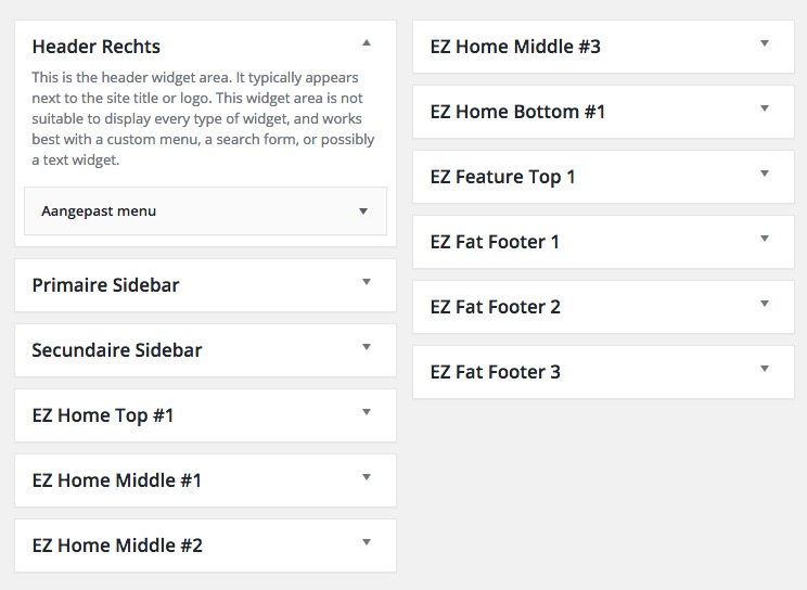
The widget EZ Feature Top 1 is for every page. So for all ‘top’ hero images, on the homepage we use the EZ Home Top #1 widget and for all other pages EZ Feature Top 1.
Skin
Dynamik does not offer directly a fixed header menu when scrolling the page. A couple of available skins (in fact a collection of CSS, JavaScript and CSS settings in a package) do offer this nicely. The Freshly skin met our requirements. We had to modify some things there to get the hero image (per page) under the menu.
Most important we had to force the site header to the fixed position at 0 pixels height.
.site-header {
width: 100%;
position: fixed;
top: 0;
left: 0;
z-index: 9999;
}
There are some CSS settings for the fixed and responsive menu behaviours, which we are not explaining in detail here, but can be found within the Freshly screen, free available for all Dynamik users.
Since direct placement of an image in HTML in one of the widgets won’t work responsively, we have to add the image through CSS in the style.css file of the skin.
#ez-home-top-container {
	background: #FFFFFF url('http://www.ernstmerhottein.com/wp-content/uploads/dynamik-gen/theme/images/homepage-11.jpg') top center no-repeat;
}
#ez-home-bottom-container {
 background: #FFFFFF url('http://www.ernstmerhottein.com/wp-content/uploads/dynamik-gen/theme/images/homepage-22.jpg') top center no-repeat;
}
Call-out
Another request was the possible placement of call-out texts in het center of the hero-images. In the skins style.css file we added the needed position and styling settings.
#ez-home-top-container,
#ez-home-bottom-container {
	background-size: cover;
	background-attachment: fixed;
	margin: 0;
	padding: 150px 115px;
	text-align: center;
}

#ez-home-top-container .ez-widget-area h4,
#ez-home-bottom-container .ez-widget-area h4 {
	margin-bottom: -20px;
	padding: 5px 10px 20px;
	color: #FFFFFF;
	font-size: 30px; font-size: 3rem;
	line-height: 1.2;
}

#ez-home-top-container .ez-widget-area,
#ez-home-bottom-container .ez-widget-area {
	background-color: rgba(92, 164, 79, 0.6);
	padding-bottom: 5px;
	color: #FFFFFF;
	font-size: 20px; font-size: 2rem;
	-webkit-border-radius: 10px;
	border-radius: 10px;
}

The transparant green color has been defined bij rgba(92,164,79,0.6). Have a closer look at the rest of the code, for example the padding values to position thew call-out.
#ez-home-top-container,
#ez-feature-top-container,
#ez-home-bottom-container {
	background-attachment: scroll;
	padding: 20px !important;
}
 For the reposive setting we had to change the padding to fit the green callout-area on mobile devices. The code above and example are the values and results for smartphones in portrait mode. Take care of doing this for all containers involved, so for home top and bottom and ez-feature-top for all other pages.
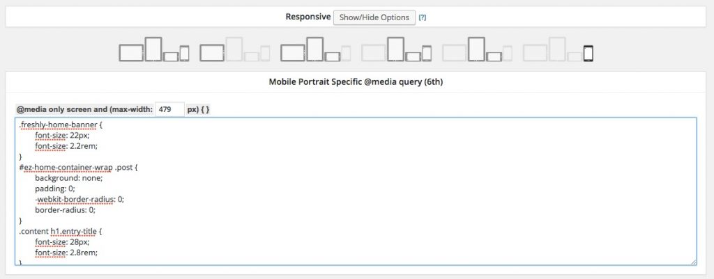
Other settings are needed for the various breakpoints defined in Dynamik Design > Responsive.
All other pages
Doing something simular with seperate hero-images require the use of conditionals in Dynamik.
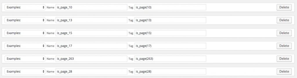
You will need the ID of every page (look at the bottom status bar in the browser while in edit mode of the page) to set the conditional in Dynamik Custom > Conditionals, starting with is_page().
For every page you need to create a conditional CSS in Dynamik Custom > Hook Boxes.
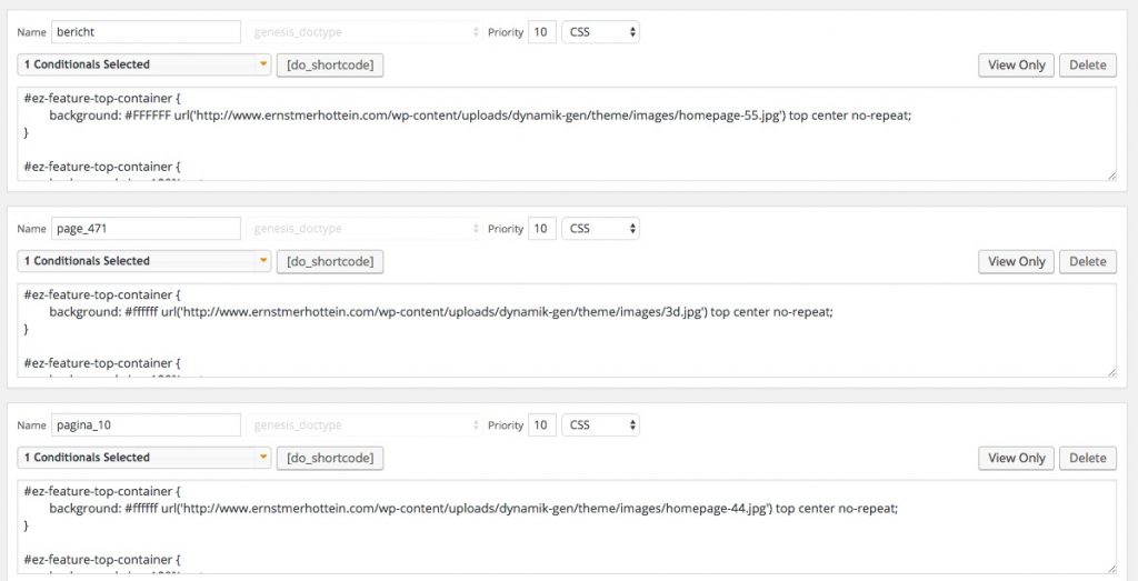
/* set image for page */
#ez-feature-top-container {
	background: #ffffff url('http://www.ernstmerhottein.com/wp-content/uploads/dynamik-gen/theme/images/3d.jpg') top center no-repeat;
}

/* set padding for call-out manin text */
#ez-feature-top-container {
	background-size: 100% auto;
	margin: 0;
	padding: 150px 115px;
	text-align: center;
}

/* set padding for call-out top text */
#ez-feature-top-container .ez-widget-area h4 {
	margin-bottom: -20px;
	padding: 5px 10px 20px;
	color: #FFFFFF;
	font-size: 30px; font-size: 3rem;
	line-height: 1.2;
}

/* set background color for call-out */
#ez-feature-top-container .ez-widget-area {
	background-color: rgba(92, 164, 79, 0.6);
	padding-bottom: 5px;
	color: #FFFFFF;
	font-size: 20px; font-size: 2rem;
	-webkit-border-radius: 10px;
	border-radius: 10px;
}

/* define page independent menu colors *.
/* Header Menu */
.site-header .genesis-nav-menu li a {
	color: #e0e0e0;
}
.site-header .genesis-nav-menu li a:hover {
	color: #000000;
}
.site-header .genesis-nav-menu li.current-menu-item a {
	color: #ff0000;
}
In the code above one example for one of the pages on the site, with explaining text above each ‘block’. This has to be done for every page to get different responsive hero-images and menu colors, depending on the colors of the image under the menu. See another example below.
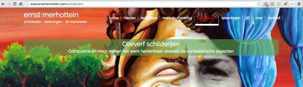
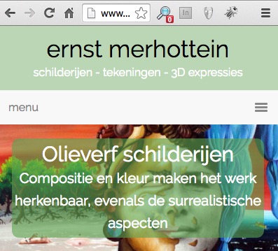 The left example is the same page on mobile with a different padding as explained for the homepage above. The menu on mobile is just a ‘normal’ hamburger-menu.
Beaver Builder
In our following testcase, we will try to get the responsive hero-image effect with call-out texts through Beaver Tunnels (compare this with conditionals) in the Beaver Builder theme. We already could say that a hero-image per page is barely a challenge, since Beaver Builder already made it possible to layout each page seperatly, so a top hero-image will be a no-brainer.
However we want to keep the call-out positioned in the image (so not under the image in responsive mode, like is the case in het BB ‘content slider’ module). A bit more of a challenge is the menu-color setup per page……
First results in Beaver Builder
GeneratePress
We will also give this one a try within the GP theme in the next couple of weeks.
